bellyfood
Bellyfood
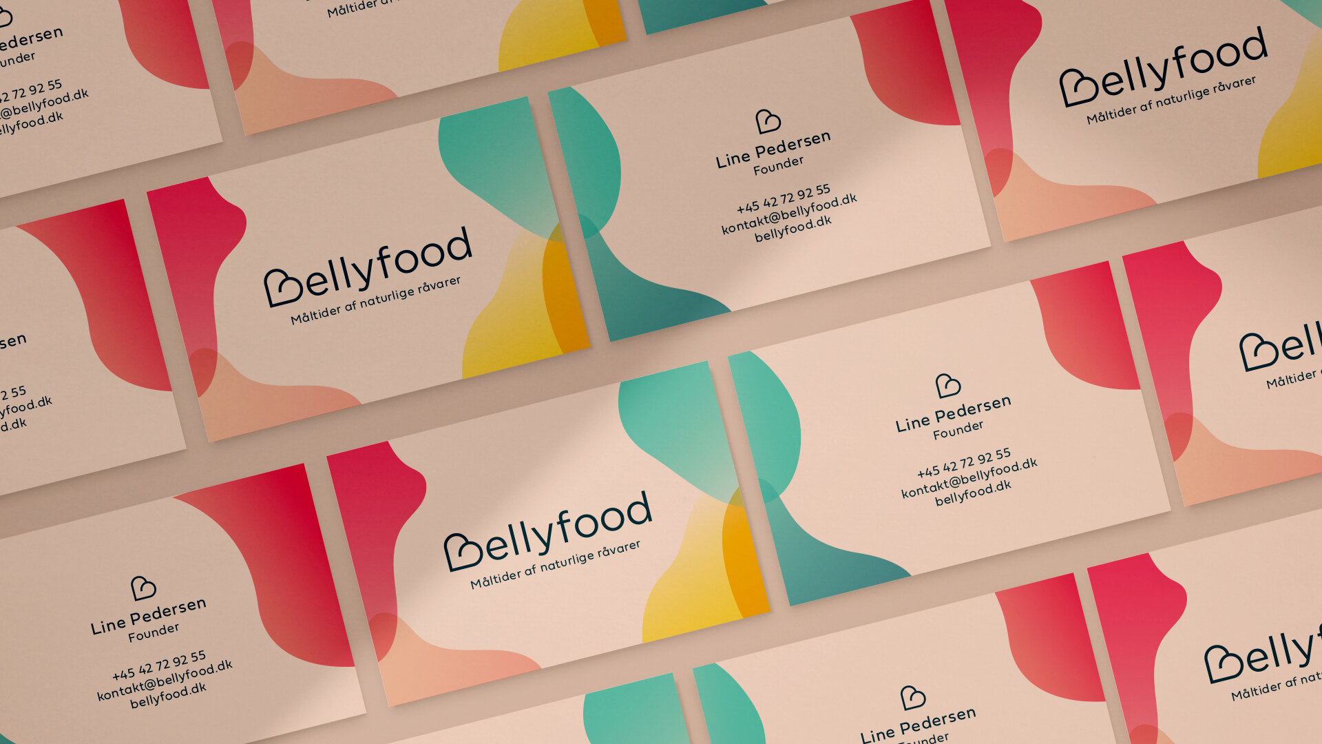
Line started Bellyfood because her son couldn’t tolerate the enteral nutrition food already existing on the market. We developed the visual identity; logo design, colors (which represents the ingredients), illustrations, and packaging design.
The B in the logo symbolises a belly and a heart for the importance of good food. We’ve translated what Bellyfood stands for into a fresh, colourful and playful visual identity. Who says enteral nutrition food needs to be boring?